You are using an out of date browser. It may not display this or other websites correctly.
You should upgrade or use an alternative browser.
You should upgrade or use an alternative browser.
ogirginc
Active member
I wanted to make header hight responsive so I used this one:
and changed it a bit to look like this:
It seems to be working but still wanted to ask if my implementation is correct/good?
PHP:
.MyContent {
float: right;
}

<xen:if is="@enableResponsive">
    @media (max-width:800px) {
        .MyContent {
        float: none;
        text-align: center;
        }
    }
</xen:if>
and changed it a bit to look like this:
PHP:
#header
{
    height: 400px;
}

<xen:if is="@enableResponsive">
    @media (max-width:640px) {

       #header {

    height: 200px;
    }

    }
</xen:if>
It seems to be working but still wanted to ask if my implementation is correct/good?
ogirginc
Active member
Yep, that is what I was trying.Yes, that will work.
The header height will be 400px until the the width drops below 640px, at which point it will be 200px.
Claudio
Well-known member
Hi Brogan
Could you please let me know if this code is ok?
Thank you!
Could you please let me know if this code is ok?
Code:
<xen:if is="@enableResponsive">
    @media (max-width:800px) {
        <xen:hook name="header_right_big" />
        }

    @media (max-width:610px) {
        <xen:hook name="header_medium" />
    }

    @media (max-width:480px) {
        <xen:hook name="header_small" />
        }
</xen:if>
Thank you!
Claudio
Well-known member
can HTML code be used instead of CSS? I just need to show images depending on the screen sizeNo, that is not valid CSS.
Claudio
Well-known member
Have you been able to get a solution?Do I have the correct usage of the predefined CSS classes ...
HTML:<div class="visibleResponsiveFull visibleResponsiveWide"> <div id="bsap_1286480" class="bsarocks bsap_a7ac845a1568bf4e1a00976b9a439ae5"></div> </div>
Desired Outcome: My BuySellAds 728x90 banner ad's will only display if the client browser display is within Full or Wide specifications, and the banner ad will not show for Medium and Small dimensions client browsers.
Thanks.
erich37
Well-known member
can somebody please post the code in order to achieve the "Notices" with images and text as Kier is showing in this video ?
But having it also show properly in "responsive". Probably so that the text is disappearing in "mobile view" ?
https://xenforo.com/community/threads/notices.18390/
Many thanks!
But having it also show properly in "responsive". Probably so that the text is disappearing in "mobile view" ?
https://xenforo.com/community/threads/notices.18390/
Many thanks!
Donny
Active member
Lads,
If I want to show a menu button only on something bigger than tablet screens, am I using the following?
<xen:if is="@enableResponsive">
@media (max-width:800px) {
.MyContent {
float: none;
text-align: center;
}
}
STICK MY CONTENT HERE FOR MOBILE?
</xen:if>
I don't think I understand it.
If I want to show a menu button only on something bigger than tablet screens, am I using the following?
<xen:if is="@enableResponsive">
@media (max-width:800px) {
.MyContent {
float: none;
text-align: center;
}
}
STICK MY CONTENT HERE FOR MOBILE?
</xen:if>
I don't think I understand it.
jonoathome
Active member
jonoathome
Active member
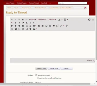
That doesn't appear to be the default editor.
You would need to seek support from the style or add-on author.
It's the same issue with the default editor too.
It's not the editor that's the problem but the background box the editor is placed in..
jonoathome
Active member
Then it's an issue with your custom style.
I am aware of that.. hence I am asking for advice to where in the template I can look in the style to troubleshoot this
Similar threads
- Replies
- 3
- Views
- 222
- Replies
- 11
- Views
- 3K
- Replies
- 3
- Views
- 655
- Replies
- 2
- Views
- 565
- Replies
- 2
- Views
- 1K

