-
This forum has been archived. New threads and replies may not be made. All add-ons/resources that are active should be migrated to the Resource Manager. See this thread for more information.
You are using an out of date browser. It may not display this or other websites correctly.
You should upgrade or use an alternative browser.
You should upgrade or use an alternative browser.
Graphics Request (forum markers:)
- Thread starter x4rl
- Start date
x4rl
Well-known member
Rofl aye I tryed me bestI'm lousy at graphics too... But I thought the mellon looked really cute! Looks like he's got legs and swinging arms, happy, dancing, smiling melon FTW!
x4rl
Well-known member
I suck at stuff like that someone made me that sig/logo plus when that's transparent it would like a orange? lime? hehe could be any of themCut the melon off of your signature graphic and use it.
x4rl
Well-known member
HahaThis is the first I've realised your new site name was AniMelon not AnimeLon
Thought it was a funny good domain name
Heh, same here.This is the first I've realised your new site name was AniMelon not AnimeLon >.>
I thought the key part of the name was Anime.
x4rl
Well-known member
Oh it is still an anime siteHeh, same here.
I thought the key part of the name was Anime.
Tigratrus
Well-known member
Might be worth recoloring the NI to the same striped green as the A. That would make the word devision a lot clearer.
I LOVE the little girl with the knives though! Like a Psyco version of C-Ko from Project A-Ko. Well.. Except she's not blond. And less annoying. And...
Well OK, I guess it's just the big mouth! Still love the graphic though.
I LOVE the little girl with the knives though! Like a Psyco version of C-Ko from Project A-Ko. Well.. Except she's not blond. And less annoying. And...
Well OK, I guess it's just the big mouth! Still love the graphic though.
Luke F
Well-known member
Might be worth recoloring the NI to the same striped green as the A. That would make the word devision a lot clearer.
I LOVE the little girl with the knives though! Like a Psyco version of C-Ko from Project A-Ko. Well.. Except she's not blond. And less annoying. And...
Well OK, I guess it's just the big mouth! Still love the graphic though.
x4rl
Well-known member
And less annoying.
Oh MY if only you knew the truth lol see dark's video ^_^
Oh yea good point! ThanksMight be worth recoloring the NI to the same striped green as the A. That would make the word devision a lot clearer.
Shelley
Well-known member
x4rl
Well-known member
Shelley your the best :3 Thank's very muchI wasn't sure whether you wanted the melon cropped out of your signature so on the offchance you did and wanted them as status icons the cropped/re-sized unread and red status icons are in the attachment.
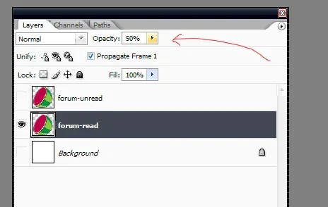
I have one question for you if you have time, how did you fade the first one I was looking for about a hour for that button/option lol... Anyway's thanks again
x4rl
Well-known member
Thanks! there is the bugger lol I was looking in there tooIn the layers palette you'll notice an opacity slider. adjusting this accordingly will give your desired affect. I'll post the psd as well.
Thanks again
Tigratrus
Well-known member
Looks great! I love the wave of the darker stripes... What a perfect logo, Susan particularly loved the melon's face.There we go changed my sig ^_^ ANI << does look better cheers Tigratrus
Similar threads
- Replies
- 8
- Views
- 672
